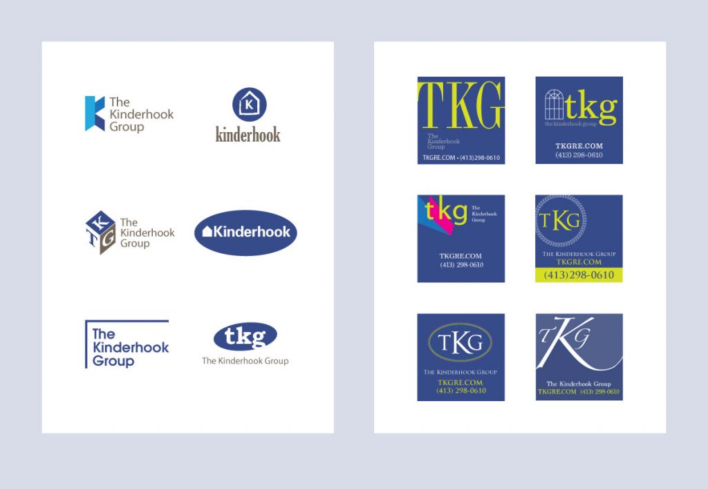
The Kinderhook Group wanted a new identity. They wanted something fresh and elegant; something completely different from their existing image. Growing larger as a real estate company, and covering more territory and states, the Kinderhook Group wanted to break out of the small NY town name—Kinderhook and build their brand in a new way.
This starts with the logo and identity. Their big change was to break away from The Kinderhook Group name and move forward using TKG as their main identifier. Below is the process of reaching that new identity.
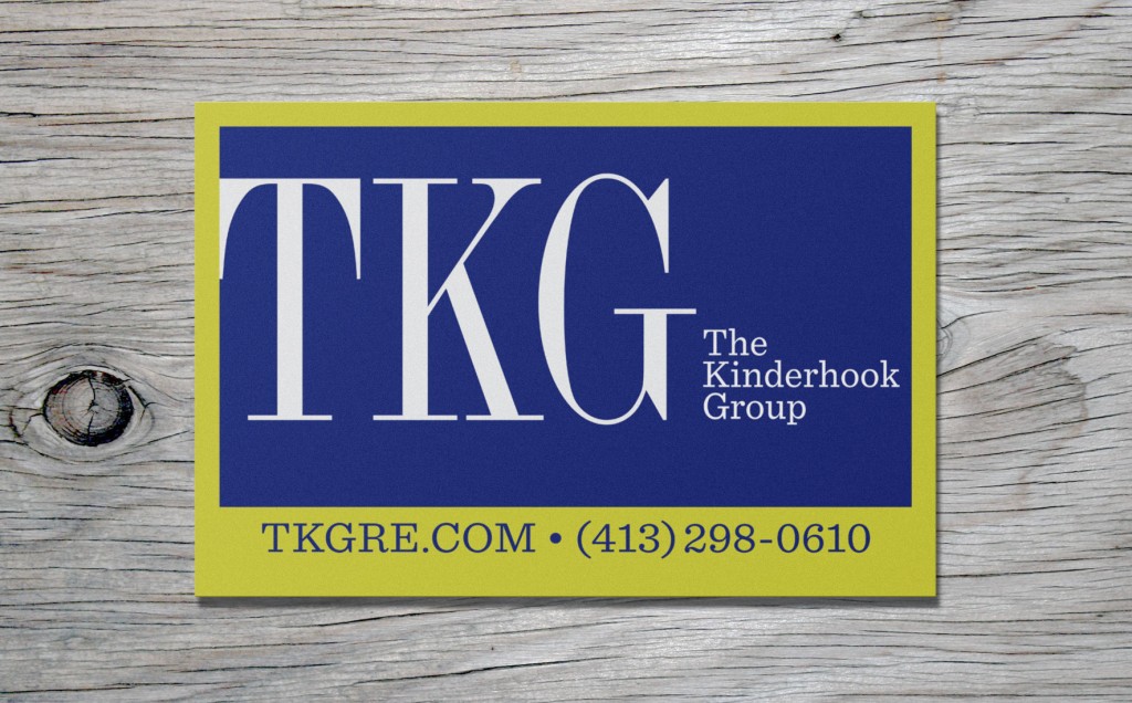
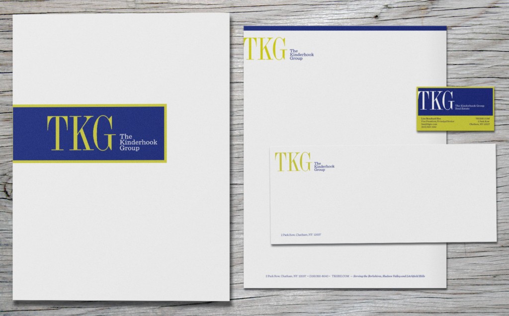
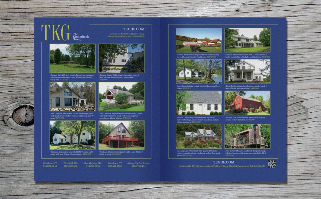
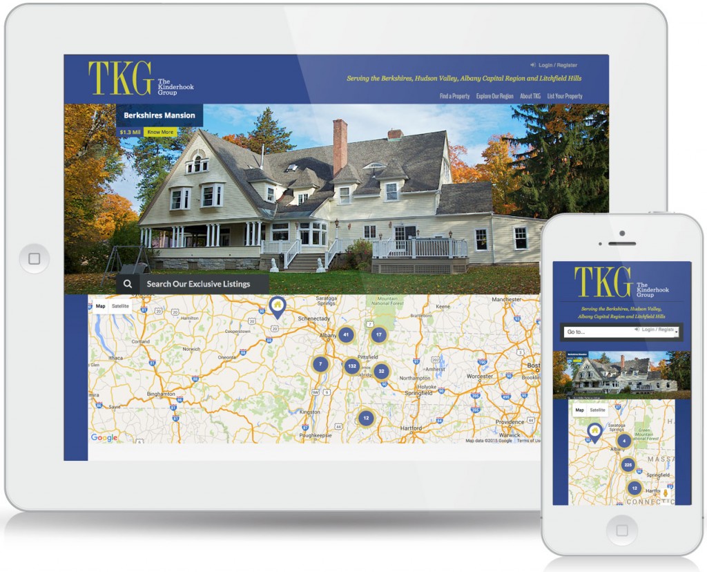
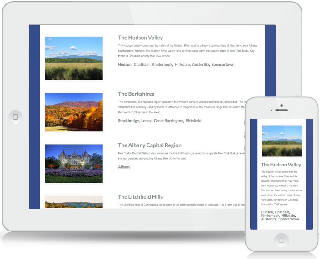
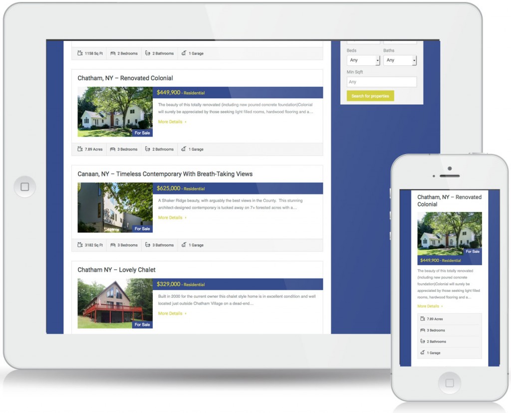

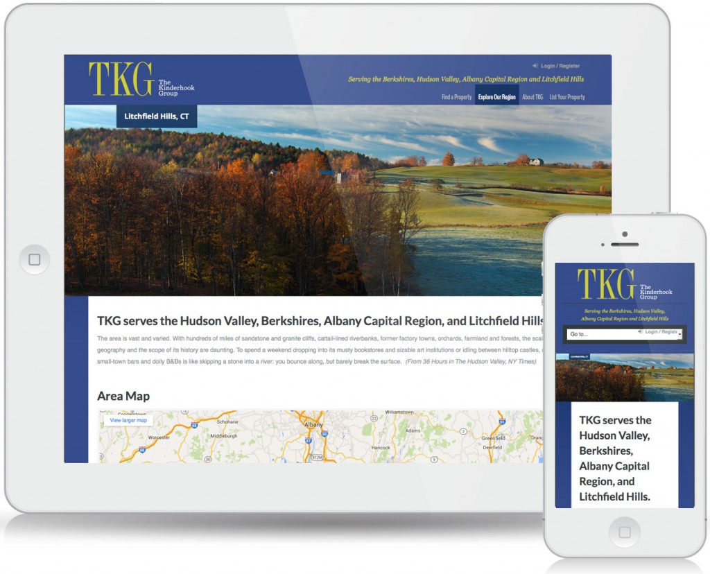
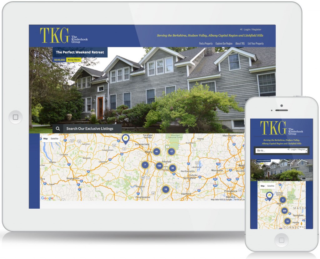
Once the final logo was refined and signed off on, we branded it across TKG’s signage, advertisements, letterhead and website. The final project shown here was to design a new website for TKG that is responsive to fit desktops, laptops and hand held devices. TKG wanted a website that they could easily add new listings to and update themselves, as well as have an IDX feed to show MLS listings in their region.